:fill(transparent,1)/GettyImages-172692800-56b098c73df78cf772cfed33.jpg)
Having a professional looking CV tailored to a specific industry significantly increases the chances of getting noticed and invited for an interview when applying for a job. Creating a Curriculum Vitae that aims to target web and graphic design agencies was accomplished via several crucial steps
- Format
Instead of trying the traditional approach of developing a traditional looking Word document that relies mainly on text information rather than a visual element, I looked into Creative CVs examples built with Adobe Photoshop and Adobe Illustrator

Using iconography, sans serif fonts and experimenting with colours was a challenge that I was willing to take in order to produce a visually impressive CV that stands out and grabs the eye of employers
- Layout
There are numerous options for defining the structure of a CV. In many ways, Graphic and Web designers aim to create a brand for themselves and then assemble CV and Portfolio around it. A lot of examples that I stumbled upon featured some kind of visual representation of the designer's identity (seldom an actual image of themselves). That led me to attempting the creating of a logo that i would use on my CV and eventually my Portfolio
The logo was designed on Adobe Photoshop. For the letters I used the TW Cen MT Condensed font. A circle shape seemed appropriate as the logo wrapper. It was later enahnced by applying a Drop Shadow effect and a glow-like touch

Despite Creative CVs demonstrating unlimited creativity which allowed designers to express themselves and tell their story in whatever way they seem appropriate, having consistency and structure are crucial as they make the final design look complete and easy to navigate through.
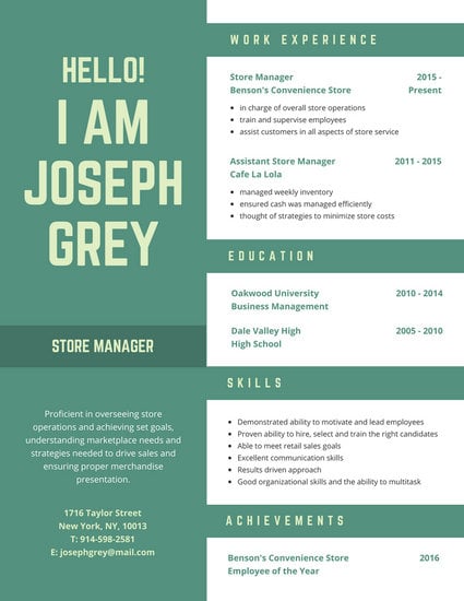
The example above shows that all key areas of the CV are segmented and easily distinguishable without the design looking too rigid. I decided to take a similar approach and aim to incorporate both creativity and clear structure into the final design of my CV
- Iconography
Using icons or any kind of visual cues to underline the meaning of a specific section of the CV is another practice that is common with creative CVs (if used in moderation). After making rough sketches of the layout, I decided to include icons under the main sections. A few other icons were also going to be used for the Skills Section but with a smaller size.
- Fonts and Colours
Following the outcome of creating a Logo, I decided to stick with the blue colour and implement different shades of it on the CV. The main font used was again TW Cen MT Condensed joined by Franklin Gothic Medium for the name section

After taking all of these elements into consideration I designed my first Creative CV. Alongside the creation of my Portfolio, its presentation has an undeniable impact on the employer's first impression when considering my application for any web or graphic design related job. Overall I felt satisfied with the result. The CV was handed to the Creative Career's office in Eldon Building for feedback.

The only thing that Creative Careers advised me to correct was the unit assignments result section. They advised me to only put the result if it was 60% or above. Apart from that the CV looked presentable and ready to be submitted to relevant application
Comments
Post a Comment