Another crucial element of assembling an online personality behind a brand is creating an accessible portfolio (or e-portfolio) which demonstrates skills and previous experience in a specific field. For that purpose I developed my own online portfolio using Bootstrap. But before I dive into the process, here is an example of my previous attempt of creating a live website concentrating on my ambition to become a web designer


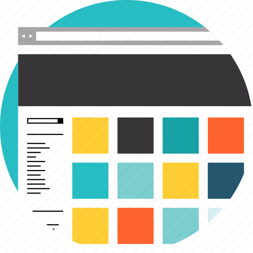
The presentation mainly relies on using dark visuals which in some cases might be considered as a trademark for one's creative work (e.g. photography or filmography). However, for a web designer, creating content which catches the eye and demonstrates creativity by using abstract shapes, iconography and vibrant colours is crucial for making their work stand out. This is why the portfolio design above would not be beneficial when it comes to applications.
In terms of its technical performance, several aspects should be mentioned:
- Heavy use of images - this would cause longer loading times (with images being the biggest asset of websites in terms of their size)
- No actual demonstration of knowledge in CSS and HTML - the prototype as mentioned was designed on Adobe Muse - a software package which acts just like Photoshop but instead of graphics it creates whole websites using a drag and drop technique
- Likely to cause issues if being made responsive - ensuring that the website is accessible on all devices would result in some of the visuals being resized - a technique that would not look very good with the logo for instance or the background note for the About section
These outcomes led to the consideration of creating a whole new portfolio design (georgi-g.com). The process for that consisted of determining the following elements:


About Me section

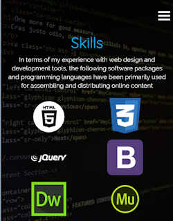
Skills section

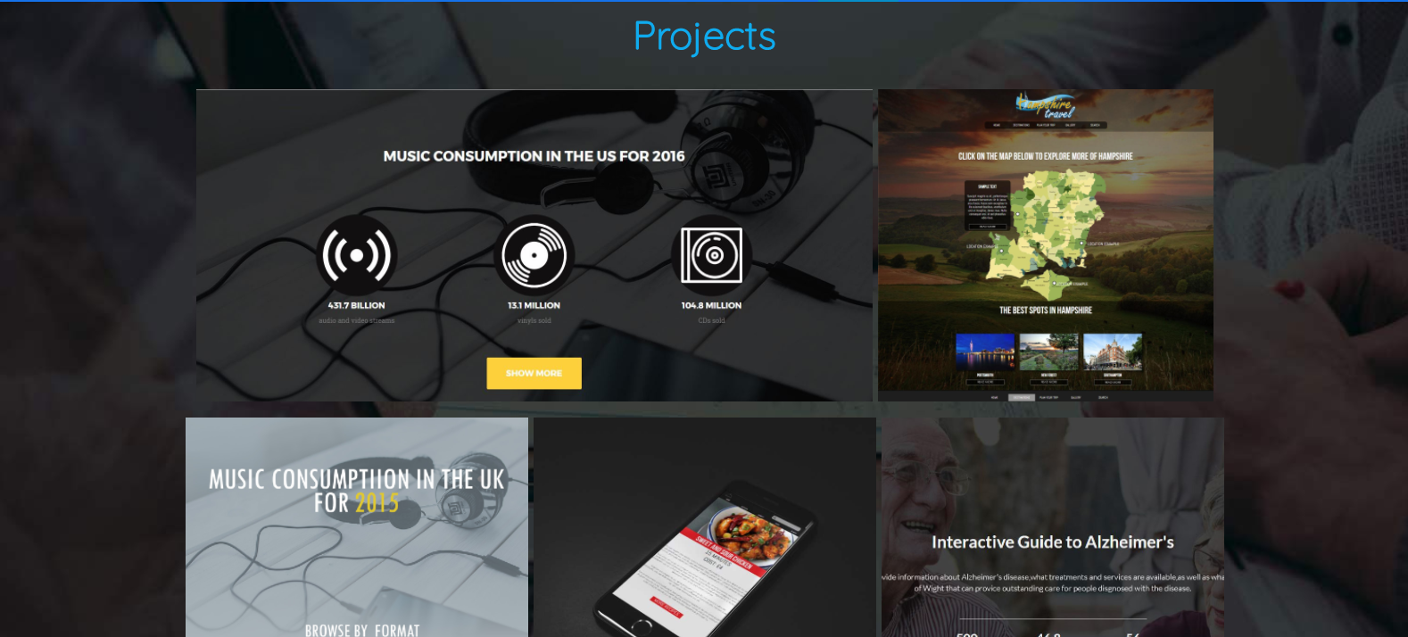
Projects section

Contact Section

Mobile view of the Skills section
Mobile menu

- Framework - being more aware of responsive design building methodologies, I decided to use Bootstrap as the foundation for my website. Bootstrap's functionality would oositively benefit the website in terms of the support of responsive design and Bootstrap elements (Modal Box plugins, sections, fixed navigation)
- Interactivity - Adding animations to the site after laying out all the content was accomplished by using another framework called Animate on Scroll. Initially I had planned to stick with Animate.css which I was used to by implementing it on another project. However, when adding it to the website it did not quite interact with the HTML elements the way I expected it to and despite looking for ways to change the functionality it would still not load the animation at the time of the scrolling. Instead, Animate on Scroll seemed to be just as effective and had better support for scrolling elements
Another interactive feature that can be noticed on the website is the parallax scrolling technique. It was accomplished by using CSS rules to define the behaviour of the section background.

Also, when doing more testing on the mobile navigation it was discovered that when clicking on the links, the page scrolls down to the selected section but that overlay navigation remains on top. The issue was solved with a Javascript code.

- Navigation
Ensuring that the user has instant access to all elements of the website was done by adding a fixed navigation. Enhanced by smooth scrolling features (again accessible via Bootstrap functionality), it results in improved user experience
- Layout
Across most sections of the website, there is not much complexity surrounding the structure of the content. However, the Projects section is displayed in a grid-like design (again using Bootstrap,s responsive features) with a hovering effect.
Final Result:
Intro section

About Me section

Skills section

Projects section
Contact Section

Mobile view of the Skills section

Mobile menu

Comments
Post a Comment